RESPONSIVE E-COMMERCE DESIGN / CONCEPT PROJECT
Seaside Furniture

DURATION
2-week sprint
MY ROLE
User research, wireframes, prototype, usability testing
TOOLS
Sketch, InVision, Miro
GOAL
The aim of this design was to provide Seaside Furniture with functional and efficient e-commerce capabilites.
PROCESS
My goal was to integrate e-commerce capabilities that offer a sense of familiarty to online shoppers. My design was informed by user interviews, contextual inquiry, and competitive and comparative analysis.
01 | Discover
UNDERSTANDING THE BUSINESS
Seaside Furniture has been family-owned and operated in New Jersey for over 63 years. The company prides itself in offering American-made, beach style furniture and creating a comfortable and friendly in-store experience. Until now, their website has mainly served as an informational source and catalog for the products that are available in-store, without a formal e-commerce functionality.
USER INTERVIEWS
I interviewed 3 participants on their furniture shopping habits to understand the in-store vs. online experience, brand loyalty, and what factors help shoppers feel confident about online furniture purchases.
“I read reviews- the good and the bad.”
All participants mentioned product reviews as an integral part of the online furniture shopping experience, a feature that Seaside was lacking.

“I need the store to keep me in the loop.”
Buying an expensive piece of furniture online is ultimately a measure of trust. Users said they needed to know when their order was coming and receive constant updates regarding their order status.

“There are so many options, where do I start?”
2 out of 3 users mentioned they recently bought furniture from Wayfair. While Wayfair is a go-to online retailer, users also mentioned feeling overwhelmed scrolling through thousands of results. Filtering is important to shoppers to narrow the scope of their search.
HEURISTIC EVALUATION
Memorability
When analyzing the memorability of the site, each user interview one common denominator: people were surprised they could not complete checkout. This isolates Seaside from its competitors, and is hard to reconcile when measuring up next to other furniture retailers.
Satisfaction
Satisfaction was rated on an average as a 2 out of 5. Users liked browsing through products, and appreciated the small business appeal of the site, but ultimately were frustrated by the navigation and inability to complete checkout.
COMPETITIVE & COMPARATIVE ANALYSIS
To get a better sense of how to address the design opportunity, I looked at four direct and indirect competitors: Wayfair, Nordstrom, West Elm, and Raymour & Flanigan. In summary, all competitors were offering a few main functions that Seaside was not: add to cart, add to wishlist, product reviews, and search filters.
Feature Inventory of Leading Competitors
02 | Define
PROBLEM STATEMENT
People need a customized online furnitire shopping experience so that they feel just as confident about their purchase as they would in a store.
PROPOSED SOLUTION
By adding product reviews, filtering options, and efficient e-commerce functionality, Seaside Furniture will offer an online shopping experience that meets the in-store expectations of its customers.
USER FLOWS (BEFORE & AFTER)
The initial user flow of Seaside Furniture shows a quick route to user failure/site abandonment. The user can typically make their way to the browse page, and is met with the option to “request information,” but is not able to see any pricing information, reviews, or an add to cart function. This leads the user to abandon the website.
Sketching an updated user flow aided me in starting the design process. I wanted to understand how I could help the user complete the checkout process with as much information and as little distraction as possible.
03 | Ideation
HAND SKETCHES

I looked to competitors and my user research to design around the problem: how can we help users feel confident about shopping on Seaside’s website?

I looked at some features on competitor websites, like a virtual design chat service, which initially seemed useful and innovative. However, I realized the research wasn’t showing me that would add value to the Seaside experience, so I moved on to other solutions. At the core, I know I needed to include clear pricing, product reviews, and multiple product photos.
04 | Deliver
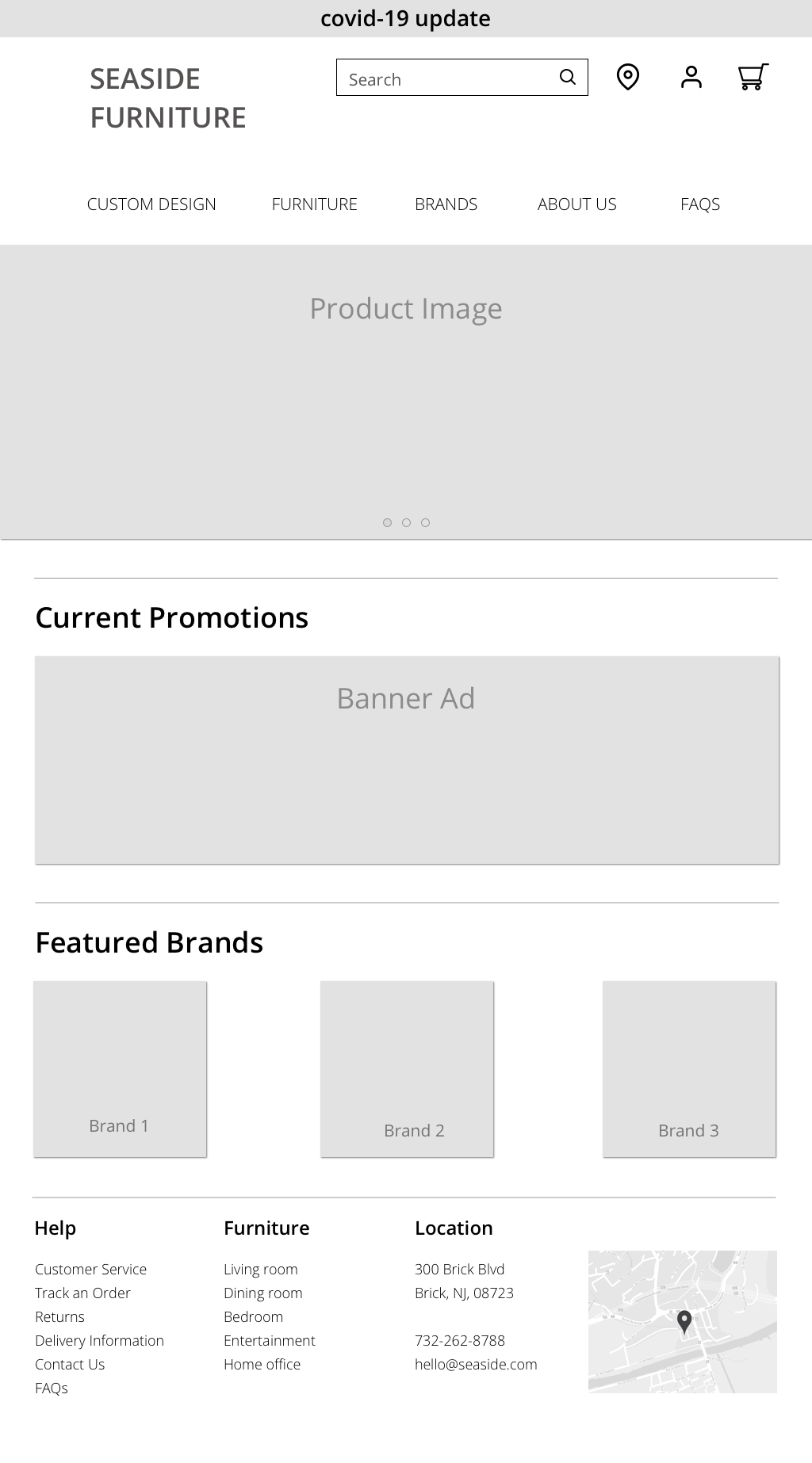
WIREFRAMES
Drawing from user interview takeaways and competitive research, I developed a set of greyscalewireframes to facilitate usability testing.


TESTING THE PROTOTYPE

Testing the prototype brought new insights and feedback for further iterations. 3 out of 4 users were accustomed to seeing the entire checkout process on one scrollable page. My initial design required users to click through separate pages for shipping/billing/payment information, and ultimately increased the likelihood of site abandonment.
I also want to explore features that increase users’ confidence in their purchase. While usability testing showed this flow to be streamlined, I wonder if the “happy path” neglected some spontaneous questions a shopper might have. For instance, when a shopper is getting prepared to spend $1,000 on a couch, they might want to compare it side-by-side with another couch, to review specs and ratings more visibly. Having ample information in the decision-making process will ultimately instill confidence and trust in the Seaside name.